Cincinnati Zoo Invitation
Overview
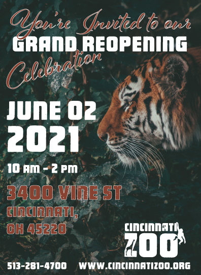
Client inquired about the creation of an invitation for the reopening of their zoo. The invitation needed to be appropriately sized to send in the U.S. mail while being visually appealing. The client requested new logo and pertinent information was included on the invitation.
Context and Challenge
Project background and description
Cincinnati zoo wanted a to rebrand the facility with a new logo and a flyer/invitation for their grand re-opening after receiving a grant from a donor. The client wanted to send out an invitation to their mail list. The invitation was to be the appropriate size to send through the U.S. Mail.
The Problem
Client not only wanted a fresh take for the logo, but the invitation needed to be to the point and include the new logo, date and time, website, and address. Client desired the invitation to be small enough to be sent in the mail, but large enough for the information to fit.
Goals and Objectives
The overall goal was to create an appropriately sized invitation to be sent to client’s mailing list through the U.S. Mail. The invitation should be visually appealing while maintaining graphic design elements and concepts.
Process and Insight
The first thing was to research what the best size for an invitation. While researching, a few sizes were considered, but ultimately 5.5 x 7.5 in was decided on, with the 0.5 in left for the bleed.

After the logo was created, the color scheme of the invitation was decided upon. The logo itself is white and it sits on a dark orange background. Because this invitation was for a zoo, I considered green to be a complementary color to the orange.

With the green and orange color scheme, I searched through Unsplash (royalty free photos) and browsed through several photos. The photo that caught my eye was a tiger hiding in foliage.
After some photo editing, I was able to resize and make it print ready at 300dpi. I wanted the date and the address to be prominent on the invitation while not obscuring the tiger or the logo.
I also needed to leave room for the bleed and this space was avoided. I used two different fonts, one font was the same font used in the logo and the other was a script font. I feel this would break up any monotony of the information presented.
Solution

Most of the information is flushed to the left of the invitation as to not obscure the tiger’s face. The logo was placed at the bottom right corner and the contrast of the white logo against the green makes it stand out.
Results and Conclusions
Ensuring that this invitation was visually appealing while maintaining stylistic concepts of graphic design was a bit of a challenge. But once I found the picture I wanted and was able to edit it, it became clear as to what direction I wanted to go with this. I didn’t have to compromise the look of the photo or the size of the font for my design to have a clean and professional look.